CUHK Faculty of Arts: A historical trip to innovate a faculty of one of HK's biggest universities
Strategy, Mentorship, UX Discovery, Client Engagement, Design Direction, UAT and Tone of Voice
Candour pays off
The atmosphere during our pitch allowed for some candour. When asked about the original colour palette of blue and yellow, I admitted that we originally went with bright orange and purple for depth and exuberance. However, we made a business decision to choose safe, highly relevant colours as it was a tender.
As it turned out, a bold and bright palette was exactly what the Dean was looking for.
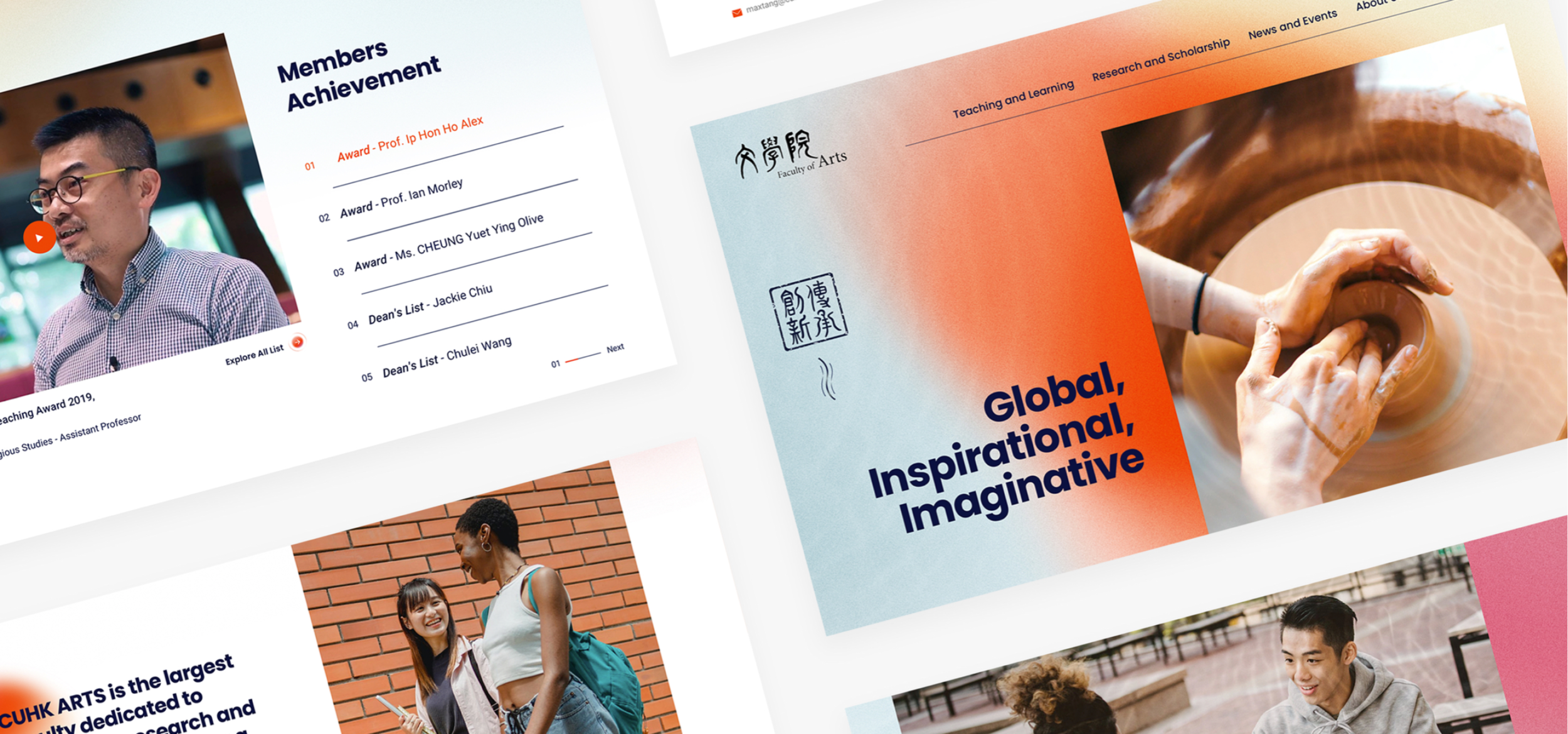
Problems
01
The site’s information architecture did not reflect the goals of the website and the Faculty of Arts. It was too informative with no clear direction.
02
The site traffic was underwhelming. Students and professors were not engaged nor encouraged to further explore the site.
03
The lack of visual appeal on all fronts, from typography to the overarching theme did not speak well for the department.
UX Discovery: Strategy Blueprint
As part of her training, I had our Junior Designer create a strategy blueprint. She was new to User Experience Design as well as handling an entire project. I went through this exercise with her a few rounds until our objectives were met.


Design Direction & User Interface
The client had a strong set of attributes that the site needed to portray. I worked with my Junior Designer in defining how the website can not only reflect, but look, speak and feel of these attributes.
Global and Innovative, Diversity
Despite the Faculty being heavily rooted in history and tradition, the site is designed to visually and structurally compete on an international standard.
Humanistic
From animation to graphics, we used ones that are organic and true in order to portray the rational being.
Depth
Elements, such as graphics, iconography and typography, have interesting qualities that require a level or two to unfold its true meaning.

A behemoth of information architecture, strategically navigable with a thumb.
The main challenge was to strategically choose or create each UI that best delivered the content without sacrificing the experience of the user, then the content itself.
Tone of Voice
It was beyond the project scope and my PM was away. I made the executive decision to provide it anyway. With a client such as CUHK and the actual time I was to spend on the requirement, the returns would be much greater than the loss.


